Most stores either don't have a browse abandonment flow running, or they treat it like a softer version of their cart abandonment. Both are wrong.
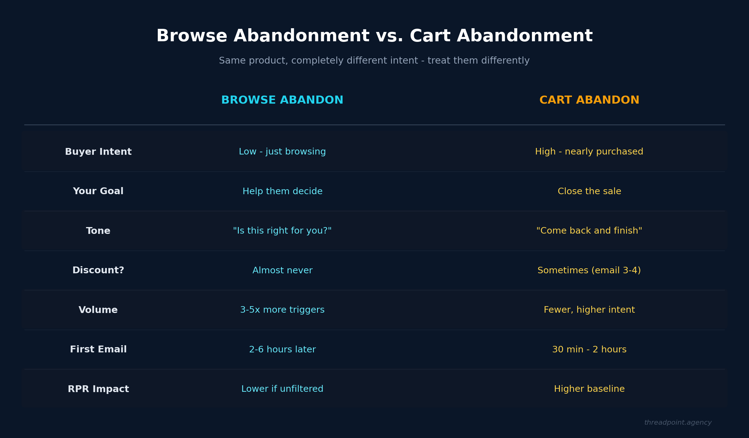
Browse abandonment and cart abandonment are two completely different levels of intent, and they need completely different strategies. Someone who added a product to their cart was one click away from buying it. Someone who browsed a product page and left? They looked at it and thought "I'm not sure this is right for me."
That distinction changes everything about how you should talk to them.
The Browse Abandon Mindset
Here's how we think about it when we're building these for clients: a browse abandonment flow is not about recovering a lost sale. This person was never close to buying. They were looking, comparing, maybe doing some research. They left because they hadn't made up their mind yet.
So the goal of the entire flow is to help them make a choice. Not push them toward one.
That sounds subtle, but it completely changes the tone and content of every email. You're not saying "hey, you forgot something!" because they didn't forget anything. They made a deliberate decision to leave. Your job is to figure out if you can genuinely help them get closer to a decision.
Before You Build Anything: Get Your Filters Right
This is the part most brands skip, and it's the most important part of the entire flow.
Browse abandonment generates significantly more triggers than cart abandonment - three to five times more, depending on your traffic. If you let everyone who views a product page into this flow, you're going to blast a massive chunk of your list with emails they don't need. Your revenue per recipient tanks, your engagement drops, and you've turned a potentially useful flow into noise.
So before a single email goes out, you need entry filters and exit conditions that actually make sense.
Entry filters - who should get into this flow:
- They viewed a product but did NOT add to cart (this is the basic one)
- Higher intent signals: they visited the same product multiple times, or they browsed multiple products in the same category
- They haven't already purchased in this session
- They're an engaged subscriber who's opened or clicked recently
Exit conditions - check these before EVERY email:
- They made a purchase since entering the flow. If someone bought something - anything - stop sending browse abandon emails. They made their choice.
- They entered the cart abandonment flow. Cart abandon is higher intent than browse abandon. If they added something to cart after browsing, let that flow handle it.
- They've hit your max email count for this flow
- They've unsubscribed or gone cold
That purchase check is the big one. We've seen brands send browse abandon emails to people who already bought. It's a fast way to annoy someone and waste a send. Put that check before every single email in the flow, not just at entry.
The Flow: Four Emails (Three Required, One Optional)
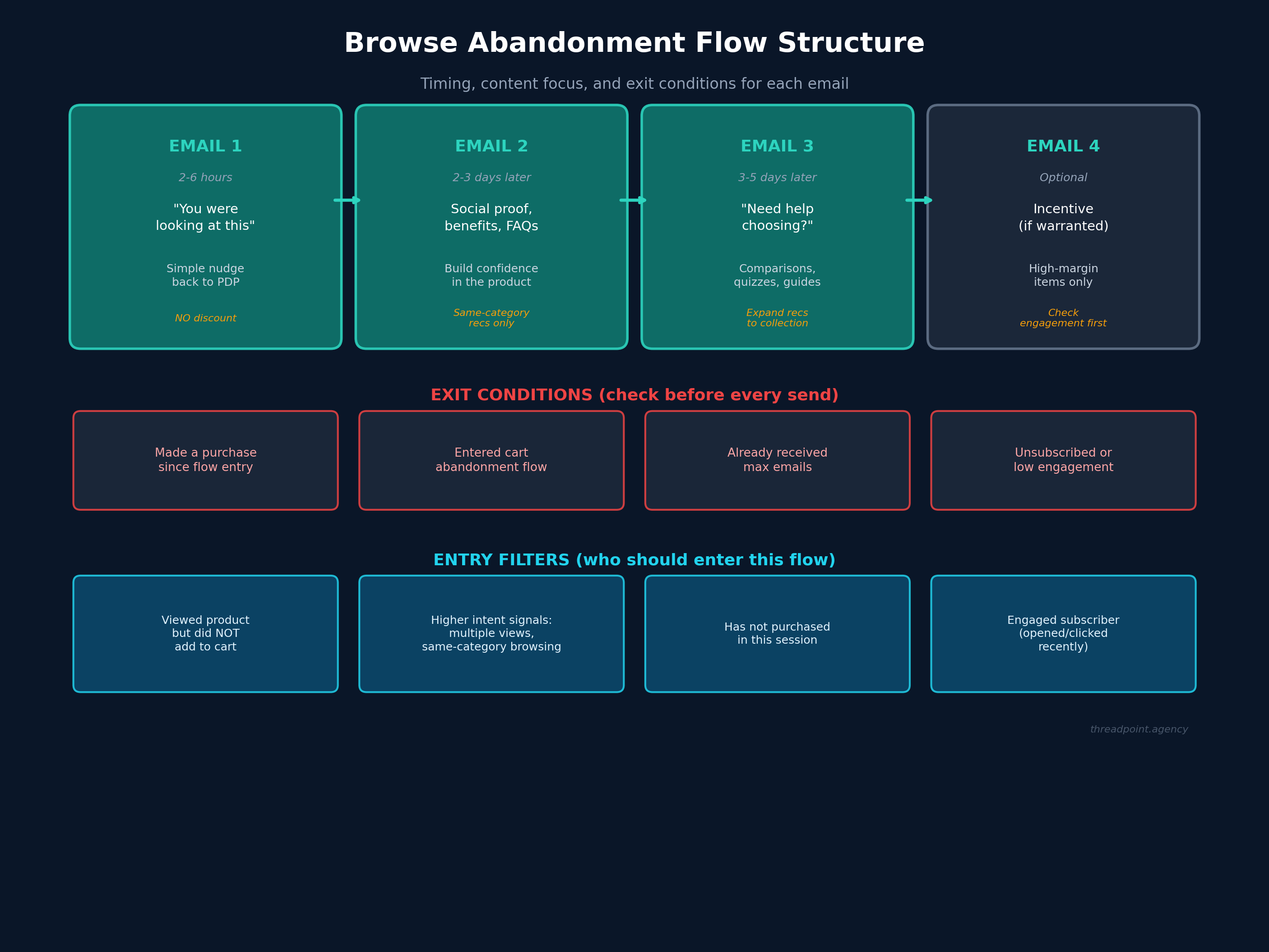
Email 1: The Gentle Nudge (2-6 Hours After Browsing)
Keep this simple. You're just letting them know you noticed they were checking something out, and here's a quick way back to that product page.
That's it.
Don't add urgency. Don't add a discount. Don't even try to sell the product. Just a clean, simple "you were looking at this - here it is if you want to come back."
The timing matters here. Two to six hours is the sweet spot. Too fast and it feels invasive. Too long and they've completely moved on.
Email 2: Build Confidence (2-3 Days Later)
If they didn't click on email one, they're still on the fence. This email is about reducing uncertainty.
Think about the questions someone has when they're browsing but not buying:
- Is this actually better than the alternatives?
- Will it work for what I need?
- Is this the right option among everything else you sell?
Answer those questions. Social proof works well here - reviews, testimonials, "X thousand people bought this." If you have strong FAQ content for the product, pull from that. Highlight specific benefits that matter, not feature lists.
You can also plant the seed for other options here. Show a few bestsellers from the same category - not random products from across your catalog. If someone was browsing blouses, show them other blouses or tops. Don't show them pants. If someone was looking at sleep aids, show them other sleep products - not an energy supplement. The recommendations need to match the specific intent of what they were researching, not just your overall bestsellers.
Keep the related products as a small section at the bottom, though. The focus of this email is still the original product they browsed.
One more thing that's easy to overlook here: the phrasing of your objection handling and FAQs needs to actually match what the person was looking at. If you're running a generic flow without category branches, this gets tricky fast. A FAQ about sizing doesn't land for someone browsing candles. A testimonial about taste doesn't help someone looking at workout gear. Spend real time making sure the content in this email feels relevant to the browsing session, not like a template that fires the same way for every product.
Email 3: Help Them Choose (3-5 Days After Email 2)
If they're still here and haven't bought anything, they probably need a different kind of help. The higher-level content from email two didn't get them there. Time to get practical.
Frame this around "need help finding the right one?" This is where product comparisons work well. If you have a product quiz on your site, this is a great place to drive people to it. Buying guides, category pages, side-by-side comparisons - anything that acknowledges they're having trouble choosing and offers genuine help.
This email gives you more room to expand the product recommendations. Link them back to the full collection page. Show recommendations based on what they browsed. The tone shift is important: you're moving from "here's the product you looked at" to "here's everything we have that might work for you."
The same rule from email two applies here, maybe even more so: every comparison, every buying guide link, every "help me choose" element needs to feel specific to what this person was actually browsing. If your flow doesn't have category-specific branches, you have to work that much harder to make sure the content doesn't feel canned. A generic "not sure which one is right for you?" falls flat when the person can tell you haven't thought about their specific product category at all.
Email 4: The Incentive (Optional - Only If It Makes Sense)
This is where most brands start their browse abandon flow, and that's the problem.
Discounting should never be your lead strategy for browse abandonment. These people haven't even decided they want the product yet. Throwing a discount at someone who's still figuring out what they want just trains them to wait for discounts.
If you do add a fourth email with an incentive, be very selective about it:
- Only for high-value, high-margin products where you have wiggle room
- Add an engagement filter - make sure they actually opened or clicked earlier emails in this flow
- Give it plenty of spacing from email three. A week or more.
- Consider alternatives to straight discounts: free shipping, bundles, loyalty points
This email is case by case. Some product categories justify it. Others don't. A high-ticket item with good margins? Maybe. A $12 commodity product? Probably not worth it.
The Real Power Move: Category-Specific Branches
If you want to genuinely supercharge your browse abandonment flow, build category-specific or even product-specific branches.
A generic browse abandon flow sends the same emails regardless of whether someone was looking at a $30 t-shirt or a $500 piece of equipment. Those two products have completely different objections, completely different buying timelines, and completely different levels of decision complexity.
And here's the part that most teams underestimate: even if you don't build full category branches, the phrasing still has to be right. Your objection handling, your FAQs, your social proof - all of it needs to feel like it was written for the product this person was actually looking at. A generic flow that fires the same "still thinking it over?" email with the same three FAQs regardless of whether someone was browsing a $30 moisturizer or a $200 jacket feels lazy. The pre-buyer knows it's canned. This is a challenge worth spending real time on, whether you're building category-specific branches or keeping things generic. The content has to match the experience, or you're just adding noise.
When you break out your flow by category, you can:
- Tailor FAQs to the specific product type
- Highlight category-relevant social proof
- Adjust timing based on typical consideration periods
- Offer incentives only where margins support it
- Show actually relevant alternative products
Yes, this is more work to build and maintain. But the performance difference between a generic "you left this behind" flow and one that actually speaks to what the person was researching is significant.
The Bottom Line
Browse abandonment is not a watered-down version of cart abandonment. It's a completely different conversation with a completely different customer mindset.
Be selective about who enters the flow. Check your exit conditions before every send. Lead with help, not sales pressure. And save the discounts for the people and products where they actually make strategic sense.
The brands that get this right aren't just "recovering" browse sessions. They're building a relationship with someone who's still figuring out what they want - and making sure that when they do decide, they come back.
If you're still building out your core Klaviyo flows, browse abandonment should be on your list right after your post-purchase flow is solid. It won't convert like cart abandon, but when it's built right, it fills a gap that nothing else covers.


